Tools like Webflow, Wix’s Editor X, and Wordpress plugin Elementor will all create coded websites as the final deliverable - but this is not the case with Sketch. Sketch can give you CSS properties for individual elements, but not for entire layouts, and Sketch's final deliverables are images that need to be ‘prototyped’ (one way or another) to emulate a working website.
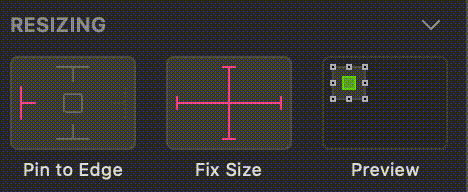
Sketch does however have some useful features that can aid in the planning of responsive layouts. The ‘resizing’ section of the attributes panel to the right of the main workspace features two options and a preview box:
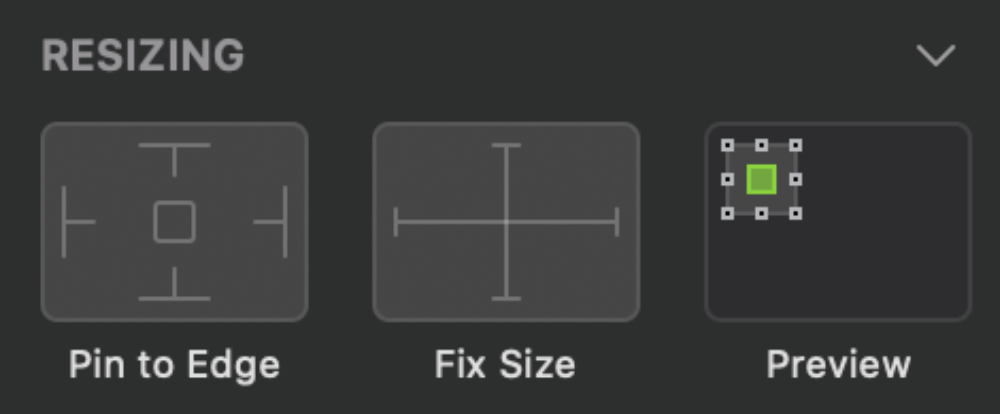
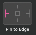
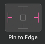
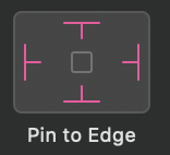
1. Pin to Edge
2. Fix Size
3. Preview
1. Pin to edge
This option will ‘pin’ an element to the edge of its parent container. Parent containers can be either a folder in your layers panel, or an entire artboard can act as a parent container.
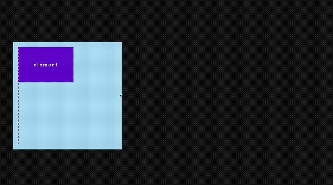
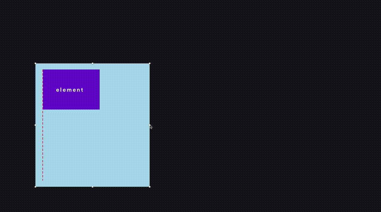
The above animation shows the resizing of a parent container with no pinned elements. Notice how the red dotted guideline and the purple box element both move slightly to the right as the parent container is stretched. This is not how the web behaves.
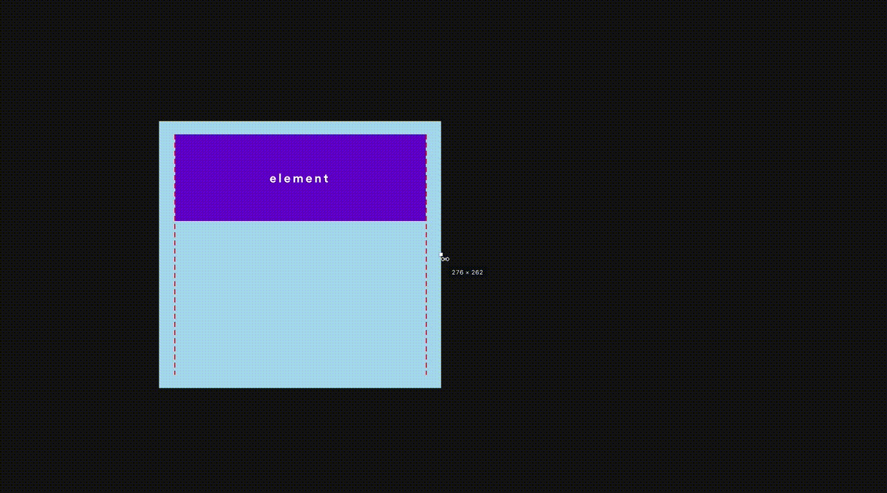
This next animation shows the same resizing action, but with the red dotted guideline and purple box element both pinned to the left edge. One can see that this is more indicative of how an actual web page would respond.
This third animation above represents a fluid width element, achieved by pinning an element to both the left and right edges. Useful for things like full width headers and footers - or any section that stretches to the edges of the design.
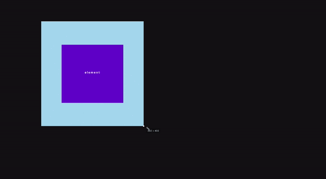
Finally here we see an element pinned to all four edges, which in responsive design terms could represent an element stretching to a percentage of the viewport (possible with vh or vw units).
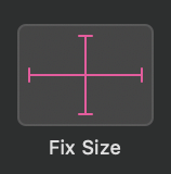
2. Fix size
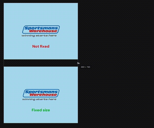
The ‘fix size’ option gives you the ability to fix an element’s size horizontally, vertically, or both. This is useful for things like logos when it’s important to maintain the aspect ratio.
3. Preview
This feature shows a visual preview of the settings you have applied without you having to actually resize the artboard. Hover your cursor over the ‘Preview’ area to see the animated thumbnail preview of your settings. The green block represents your element inside its parent container.
Application
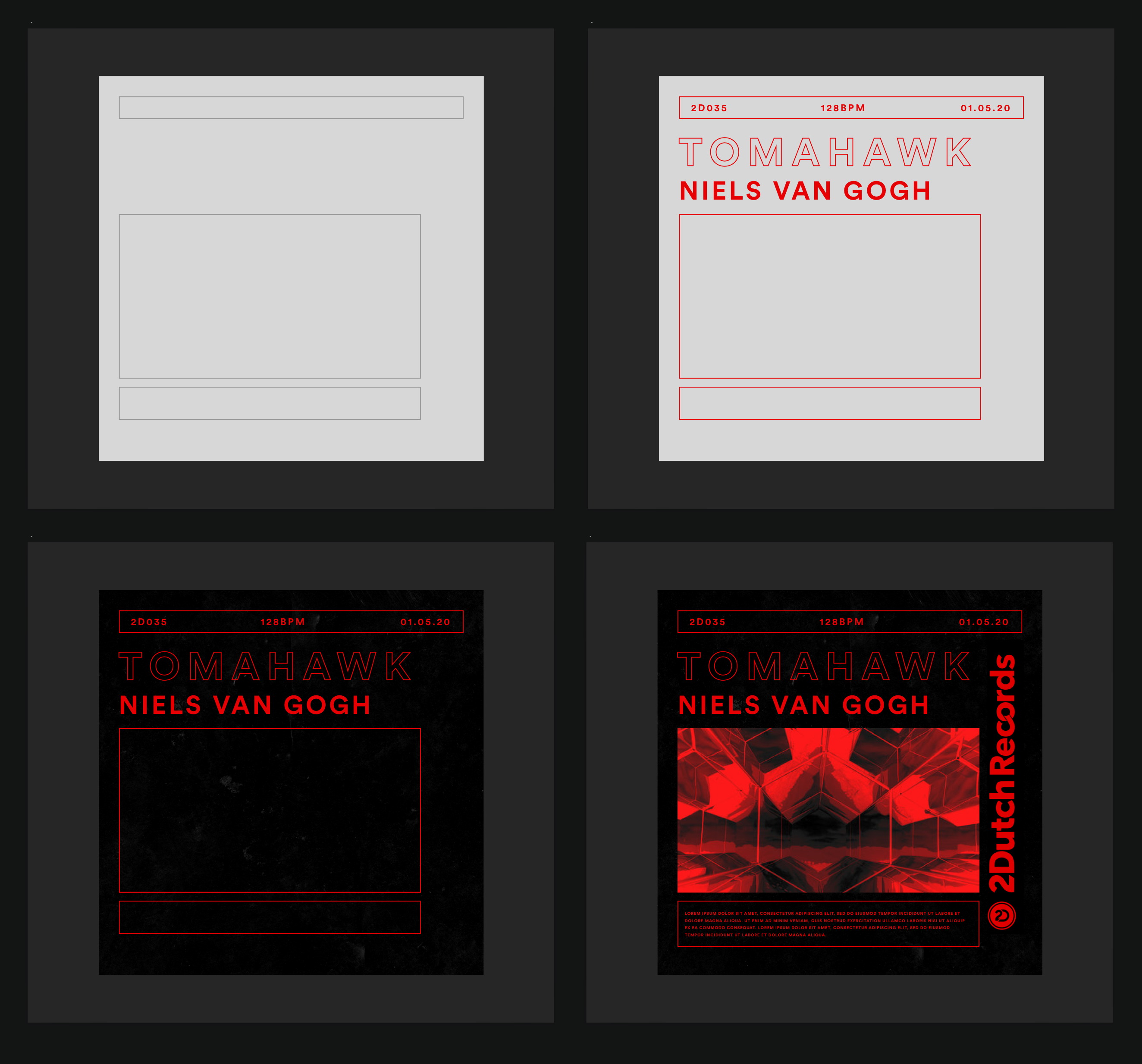
An interesting and fun exercise is to look at design examples outside of the web eg. posters, album art, etc and try to recreate them as responsive layouts in Sketch.